Gold-Silver Ratio 2026: The Ratio That Says More Than Two Individual Prices
April 20, 2026

At first glance, the gold-silver ratio is just a division: the price of gold divided by the price of silver. In practice, it is a condensed indicator of market regimes. If the ratio rises, caution often dominates; if it falls, cyclical optimism or silver momentum frequently gains ground.
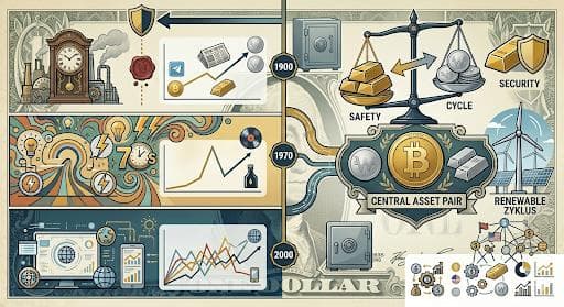
The Monthly Gold Compass provides long-term anchor points for this. The monthly average values are stated there as 68.87 since 2000, 60.23 since 1970, and 52.17 since 1900. This is editorially valuable because it takes the ratio out of the realm of gut feeling and places it within historical normal ranges.
Why is this relevant in 2026? Because both metals are trading at high price levels, and relative movements have a stronger impact on portfolio perception. If gold performs very strongly in a short period while silver lags behind, the ratio can rise – and that is often interpreted as a “defensive signal.” Conversely, during momentum phases, silver can temporarily outperform gold, causing the ratio to fall and making market sentiment appear more risk-tolerant.
Macroeconomics also plays a role here: With US inflation at +3.3% y/y and an interest rate environment where the Fed Funds upper limit is at 3.75%, 2026 is a year in which small changes in expectations can trigger large relative price movements. This is precisely why the ratio is worth a second look: not instead of gold and silver, but in addition to them.
The ratio is not an oracle. However, it is a good tool for classifying phases: When does “safety” dominate and when does the “cycle”? Those who monitor precious metals gain a clear, simple metric that conveys a surprising amount of context.
Table: Gold-Silver Ratio – Long-term Monthly Averages
|
Period |
Monthly Average |
|
since 2000 |
68.87 |
|
since 1970 |
60.23 |
|
since 1900 |
52.17 |
Stay forward-looking
Yours, Helge Peter Ippensen